Showing posts with label artwork. Show all posts

Tuesday, September 8, 2009

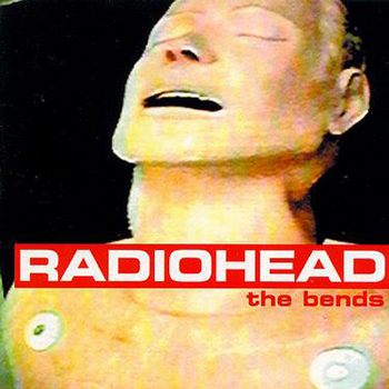
Me, If I Were Radiohead's "The Bends"


Radiohead is, like, the greatest band ever. Except maybe the Beatles. I vacillate. At the very least, Radiohead took up the Beatles' banner, continuing in their spirit of musical experimentation and fearless innovation. But in lyrical content, I have to give the edge to Thom Yorke. Radiohead isn't saddled with the psuedo-stories of a Paul McCartney, and who doesn't enjoy an awesome song about alienation, isolation, techno-shock or rabbit diseases?

One of my favorite things about Radiohead is the way they marry graphic arts with their music. Stanley Donwood, Radiohead's artist friend, has created some incredible images... from the dreary collages of "Ok Computer" to the icy compu-landscapes of "Kid A" to the battered library books of "Amnesiac" to the info-overload street maps of "Hail To The Thief." Stan Donwood also worked with Yorke on the cover of "The Bends," Radiohead's second album. It was made, apparently, by morphing Thom Yorke's face onto a photograph of a medical dummy. It's not my favorite of Radiohead's album covers, but it was the easiest to make look like me.
Wednesday, September 2, 2009

Me, If I Were A Communist Leader Portrayed On State Propaganda


This could be considered the one that started this whole obsession for me...

As the universal health care debate rages on, I've become increasingly annoyed with people chucking the word "socialism" out there like so much confetti. It's silly. I feel like we've thrown back to the era of McCarthy when communism and socialism were these terrible evils out to destroy the world.

Since a lot of my viewpoints were being criticized as socialist, I decided to change my Facebook profile picture to reflect that. So I drew myself in the style of an old Russian state propaganda poster. I wasn't sure I could convey the look, but I was so pleased the results that I started to wonder what I would look like as other things...

So this is, in essence, the debut of the whole concept. Looking at it now, it seems a little primitive to what I've made after, but that makes me happy. It means I'm getting better.

Tuesday, September 1, 2009

Me, If I Were Flip From Winsor McCay's "Little Nemo In Slumberland"


My favorite comic strip of all time is Winsor McCay's "Little Nemo In Slumberland." If that guy could've lettered his word balloons a little better and actually written dialog, there would have been no stopping the Little Nemo train. As it is, readers will just have to settle for lush, mind-bending art done in a beautiful turn of the (last) century style with gorgeous, muted colors and beds that grow giant legs and tower over the Empire State Building.

Flip, one of the characters, is a beard muzzled, cigar-smoking, conniving jerk who somehow becomes Nemo's best friend. He's also supposed to be a kid, which is weird, given the muzzle and cigar. And his skin is green.

I can't find the original panel I used as reference for this picture of me as Flip, but here's one to give you an idea of what the guy looked like when drawn by McCay.

Monday, August 31, 2009

Me, If I Were One Of H.R. Giger's Aliens


When I was in middle school, a girl I had a total crush on showed me a copy of H.R. Giger's Taschen collection, "Arh+," that her parents had, strangely, gotten her for Christmas. Apparently they were unaware of just how graphic Giger's biomechanical art could be. If you're unfamiliar with H.R. Giger, there are a LOT of varieties of mechanoid sphincters in his work. A LOT. And dead babies. It's not traditional Christmas fare.

One thing I did learn, though, is that the Xenomorph, the alien from the "Alien" movies, was also designed by Giger. And I thought that was pretty freaking awesome. The "Alien" aliens are incredibly creepy, disgusting looking and sufficiently otherworldly to make them a contender for modern horror archetypes... kind of a Universal monster for my generation.

They're also ridiculously hard to draw. This was reaching. I'm not even a mote of the artist that Giger is, so replicating an alien in his style was a challenge. While I didn't quite succeed, I think I managed a respectable showing... the glasses and goatee look especially like an afterthought on this guy...


Sunday, August 30, 2009

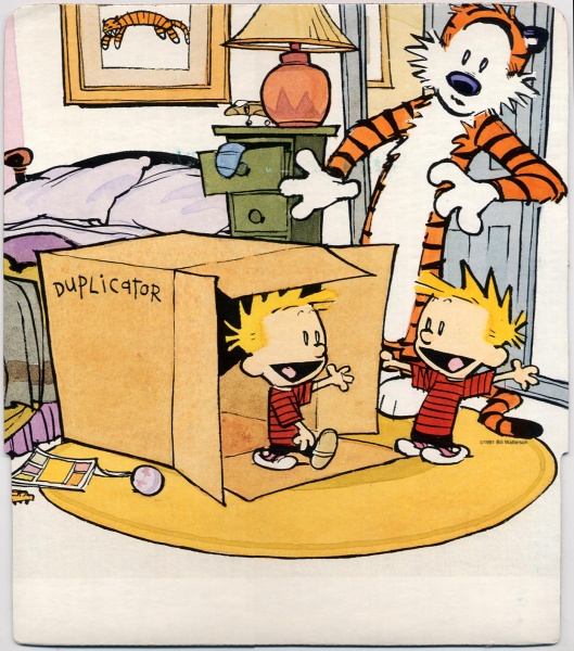
Me, If I Were A Kid In Calvin & Hobbes' Neighborhood


So, my second favorite comic strip of all time is Bill Watterson's "Calvin & Hobbes." I think he's a remarkable artist and the sheer variety of his strip, which features only a handful of regular characters, is staggering. Spaceman Spiff, Tracer Bullet, Stupendousman... all of Calvin's alter egos allow Watterson to explore and invent in other genres even as he pokes fun at them (not unlike what I'm trying to do with this blog...).

I'm a "Calvin" nut... I have all the books, including one printed for the 10th anniversary of the strip... That one's my favorite, because it allows a look in at Watterson's mind, his creative process, his struggles and his inspirations. Also, it opened a door on one of my favorite comic artists' prejudices. In one fantastic strip, Calvin delineates the different between "low art" (commercial illustration, like comic strips) and "high art" (an ironic painting of a comic strip). It's a valid point... why is Roy Lichtenstein, with his framed pictures of comic strip style art, museum-worthy, while the sketchy wonder of something like "Calvin & Hobbes" is ghettoized to "museums of sequential art." It's unfair and Watterson makes a good point.

Later in the book, though he takes a shot at "graphic novels," and how dressing up superheroes with a harder cover and better binding still leaves them just as dumb. But how is that fair, Bill? How can you judge an entire body of work with one simple, insulting adjective. There certainly ARE dumb graphic novels (I would say a goodly portion of them...), but there are WAY more dumb comic strips. So while Bill doesn't think it's fair to treat comic strips as "low art," he's perfectly content with keeping comic books in their sub-literature state. Not that that affects the brilliance of his work or anything... I just thought it was interesting.

Anyways, here I am drawn in Watterson's style... and I'm just noticing now I have five fingers on my right hand. In real life and in the drawing. *sigh* I should've caught that. Oh well.


Friday, August 28, 2009

Me, If I Were The Mad Hatter


"Alice's Adventures In Wonderland" is my absolute favorite book of all time. I'm totally obsessed with it. I collect copies of it. I have, like, a hundred and fifty or so. Seriously. I'm that weird. I love having different versions to see how various artists portray Lewis Carroll's surreal world. It's amazing how many different ways you can convey that a Hatter is, in fact, stark raving mad. When you include all of the filmed versions of it, the sheer variety of images is pretty darn staggering.

But in my head, the characters will ALWAYS appear the way Sir John Tenniel drew them in the first published edition. I'm sure a lot of people have the Disney versions as their mental "Alice" defaults (if, uh, they have any mental "Alice" defaults at all), but I think Tenniel's skritchy, detailed drawings capture the unbridled weirdness of Wonderland better than lush cell paintings ever could.

My favorite picture from the two "Alice" books is that of Alice holding the pig (that had once been a baby) after rescuing it from the Duchess' house. I, however, didn't want to draw myself as Alice, because, well, that'd be a little weird. So I drew myself as the Mad Hatter instead. Note the sneaky positioning of "Danger" onto his hat...

CHANGE PLACES!


Me, If I Were The Old School Early Version of Charlie Brown


As with most cartoonists, Charles Schultz is one of my heroes. What he could do with a few simple lines, a dot or two and squiggle was just freaking amazing. Half a century has a way of diluting the power of anything, much less a gentle comic strip about philosophizing children, and the overexposure of the "Peanuts" brand has made Charlie Brown and his friends such a staple of our pop culture that it's easy to overlook just how good those comic strips were. Especially in the beginning. Charles Schultz drew "Peanuts" for decades, and his style morphed and his sense of humor changed and to keep up a daily grind, he eventually started resorting to increasingly bizarre stories and totally weird punchlines before he surrendered the strip just prior to his death. Even those later strips, I believe, have value, but I believe his best work was done at the dawn of the "Peanuts" era. In the beginning, the kids all had enormous craniums and wide faces and a fluid look to them that become stretched and pinched as time went on. Personally, I think the early version of Charlie Brown squashes the later one like a grape.

So, here's me as the old school early version of Charlie Brown. The picture is cribbed from the cover of the first volume of "The Complete Peanuts," which features Charlie taken from an early strip panel and then given a shadow by the cover designer (and another of my favorite cartoonists) Seth.


I've heard it remarked that NOBODY but Schultz can draw Charlie Brown and get it exactly right... there's always something off about it. Better men and women than me have tried and failed. But I think I did ok. Not quite up to par, but I've seen worse.

Good grief!

Thursday, August 27, 2009

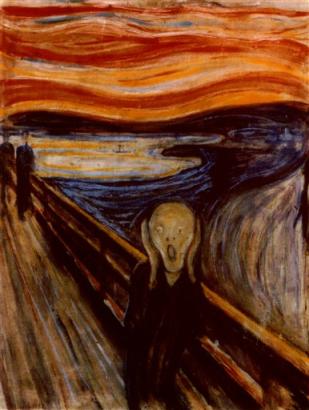
Me, If I Were "The Scream"


So, "The Scream" by Edvard Munch must be one of the most recognizable paintings on the planet. This planet. Our planet. Not, probably, on Alpha Centauri... unless, I suppose, we've beamed it to them. But even then, it couldn't have gotten there yet. But, here on Earth, it's awfully recognizable. If you showed it to most people, they'd probably be all like, "Yeah, I know that painting. It's 'The Scream.'" I'll bet some of 'em even know that Edvard Munch painted it. But more people probably just know the name. It's a pretty great painting. And famous.

So here's a picture of me, y'know, if I were "The Scream." It's just a detail... I didn't think I needed to recreate the whole picture. So I didn't.